


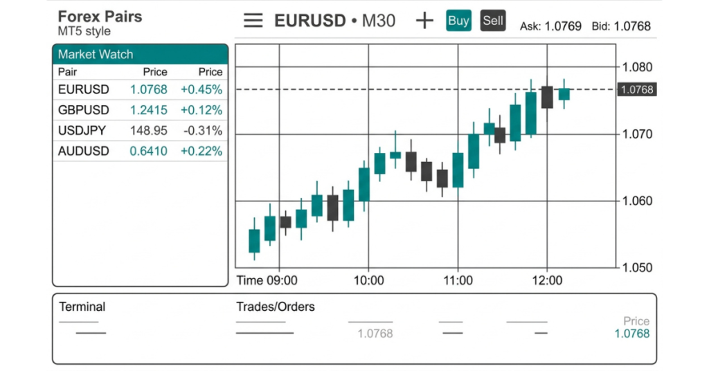
For most beginners the candlestick chart is the best choice. A single candle shows the open, high, low, and close for a period, so you learn to read price and momentum at a glance. It is clear, widely used, and the default on MetaTrader 5.
Key takeaways
- Candlestick charts are the standard first choice, showing open, high, low, and close in one shape.
- Line charts are the simplest to read but only plot the closing price, so they hide a lot of the story.
- Bar charts carry the same four prices as candles but are slower to scan, so few beginners pick them.
- Colour tells you direction at a glance: a filled or coloured body usually means the price closed lower, a hollow or light body means it closed higher.
- Whichever chart you choose, learning to read it matters far more than the type itself.
Forex chart types at a glance
These chart types cover almost everything you will see as a beginner. The table below lines them up on the things that actually matter when you are starting out: how much they show, how easy they are to read, and what they suit best.
| Chart type | What it shows | Ease for beginners | Best for |
| Line | Closing price only, joined into one line | Easiest to read | A quick view of overall trend |
| Candlestick | Open, high, low, close, plus direction by colour | Easy once learned | Everyday trading and pattern spotting |
| Bar (OHLC) | Same four prices as a candle, shown as ticks | Harder to scan | Traders who prefer a minimal look |
| Heikin Ashi | Smoothed, averaged candles | Easy to follow trend | Filtering out market noise |
Why candlestick charts win for beginners
Candlesticks became the standard for a good reason. Each candle answers the questions a trader keeps asking: where did the price open, how far did it travel, and where did it settle. You get all of that from one shape, without reading any numbers.
They also make behaviour visible. A long candle with a small wick shows strong, one-sided movement. A small candle with long wicks on both sides shows a tug of war with no winner. Once you have seen a few of these, you start reading market mood instead of just price.
That readability is why candlesticks form the basis of most chart patterns. Reversal and continuation signals, from a simple bullish candlestick to the inverted hammer, are all built from candle shapes. Learn the candle first and the patterns follow naturally.
How to read a single candlestick
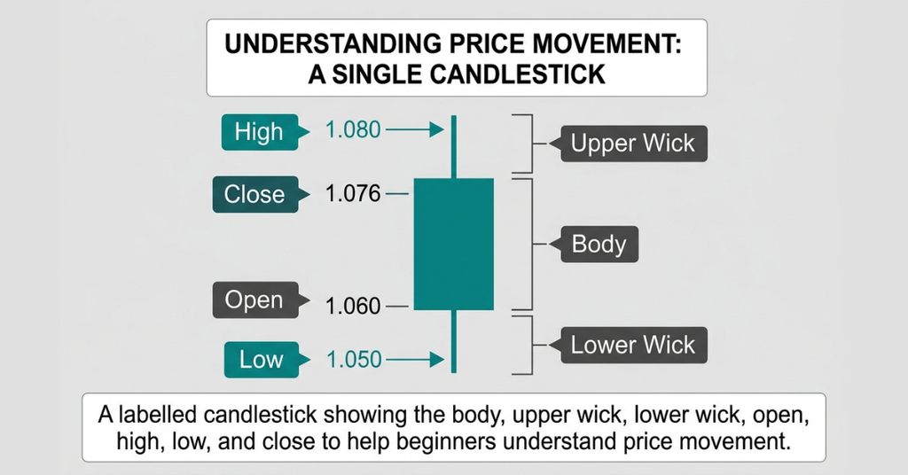
Every candle has two parts: a body and its wicks, sometimes called shadows. The body is the thick block between the open and close. The wicks are the thin lines above and below, marking the highest and lowest prices reached. Here is what each part tells you.
| Part of the candle | What it tells you |
| Body | The range between the open and close price for the period |
| Colour of body | Direction: one colour for a close above the open, another for a close below |
| Upper wick | The highest price touched, before sellers pushed it back |
| Lower wick | The lowest price touched, before buyers lifted it back |
| Long body | Strong momentum in one direction |
| Small body, long wicks | Indecision, with buyers and sellers evenly matched |
Once single candles make sense, the natural next step is reading them in groups. If you find standard candles busy, some beginners prefer Heikin Ashi candles, which average the data to show a cleaner trend, though they hide the exact open and close.
Line and bar charts, and where they still fit
The line chart
A line chart connects only the closing prices. That makes it the cleanest view of all, and it is genuinely useful for one thing: seeing the big-picture trend without distraction. Many experienced traders glance at a line chart first to judge overall direction, then switch to candles for the detail. As a beginner you can do the same.
The bar chart
A bar chart, also called an OHLC chart, holds exactly the same four prices as a candlestick. The difference is presentation. Instead of a coloured body, it uses a vertical line with two small ticks, one for the open on the left and one for the close on the right. It works fine, but most people find candles faster to read, which is why candles have largely taken over.
Choosing your timeframe as a beginner
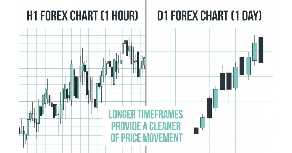
The chart type is only half the decision. The other half is the timeframe, which sets how much time each candle covers. New traders often jump straight to one-minute charts, chasing fast action, then get overwhelmed by the noise.
A calmer start is the one-hour or daily chart. Each candle covers more time, signals are cleaner, and you are not forced to make split-second calls. You can always move to shorter timeframes later, once the reading price feels natural.
4 Common beginner mistakes with charts
A good chart cannot save a bad habit. These are the slips that trip up new traders most often:
- Adding too many indicators. A chart buried under ten indicators tells you less, not more. Start with clean candles and add one tool at a time.
- Staring at tiny timeframes. Watching a one-minute chart all day leads to overtrading. Zoom out.
- Ignoring the higher timeframe. A trade that looks great on the five-minute chart can be fighting a clear daily trend. Always check the bigger picture first.
- Reading colour as a rule, not a hint. A green candle does not mean buy. It only means the price closed up for that period.
Setting up your first chart in MetaTrader 5
Defcofx runs on MetaTrader 5, which is well suited to beginners and comes with candlestick charts built in. Getting your first chart on screen takes about a minute:
- Open MetaTrader 5 and pick a pair from the Market Watch panel, EUR/USD is a good first choice.
- Drag the pair onto the main window, or right-click it and choose Chart Window.
- Click the candlestick icon in the toolbar to set the chart to candles.
- Use the timeframe buttons to select H1 (one hour) or D1 (one day) to start.
- Watch the newest candle form in real time as the price moves.
That is all you need to begin. Everything else, from indicators to drawing tools, can wait until reading the candles feels comfortable.
Learning charts with Defcofx
The best way to get comfortable with any chart is screen time on real prices. Defcofx gives you that on trader-friendly terms:
| Feature | What Defcofx offers |
| Spreads | From 0.3 pips |
| Leverage | Up to 1:2000 (indices capped at 1:200) |
| Commissions | Zero |
| Swap fees | Zero |
| Welcome bonus | 40% on first deposits of $1,000 or more |
| Withdrawals | Processed within 4 business hours, including weekends |
| Platform | MetaTrader 5 |
Final Thoughts on Which Forex Chart Is Best for Beginners
Choosing the best forex chart as a beginner does not need to be complicated. Candlestick charts offer the most useful starting point because they combine the open, high, low, and close into an easy-to-read visual. Once you understand the body, wicks, and direction of each candle, you have a foundation for understanding price action and common chart patterns.
Line charts still have a place when you want a clean view of the overall trend, while bar charts provide the same OHLC information as candlesticks in a different format. Heikin Ashi can also help make trends easier to follow, but its smoothed data means it should not replace standard candlesticks when you need to see the actual opening and closing prices.
FAQ
For trading, yes. Candlesticks show four prices and reveal momentum, while a line chart only plots the close. Line charts are handy for a quick view of trend, but candles give you far more to work with.
The line chart is the simplest, because it plots a single price. It is easy but limited. For actual trading, the candlestick is the better balance of simple and useful, which is why most beginners settle on it.
Colour shows direction. One colour marks a candle that closed higher than it opened, and another marks a candle that closed lower. The exact colours depend on your chart settings, so check which is which before you trade.
The one-hour and daily charts are the friendliest starting points. Each candle covers more time, so signals are cleaner and you are not forced into rushed decisions. Shorter timeframes can come later.
Heikin Ashi is a candlestick variant that averages price data to smooth out noise and make trends easier to see. The trade-off is that it hides the true open and close, so it is a complement to standard candles, not a replacement.
MetaTrader 5 supports line, bar, and candlestick charts, and you can switch between them in one click. Candlesticks are the most popular choice among its users, beginners included.